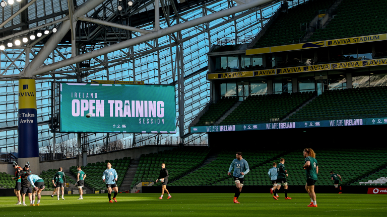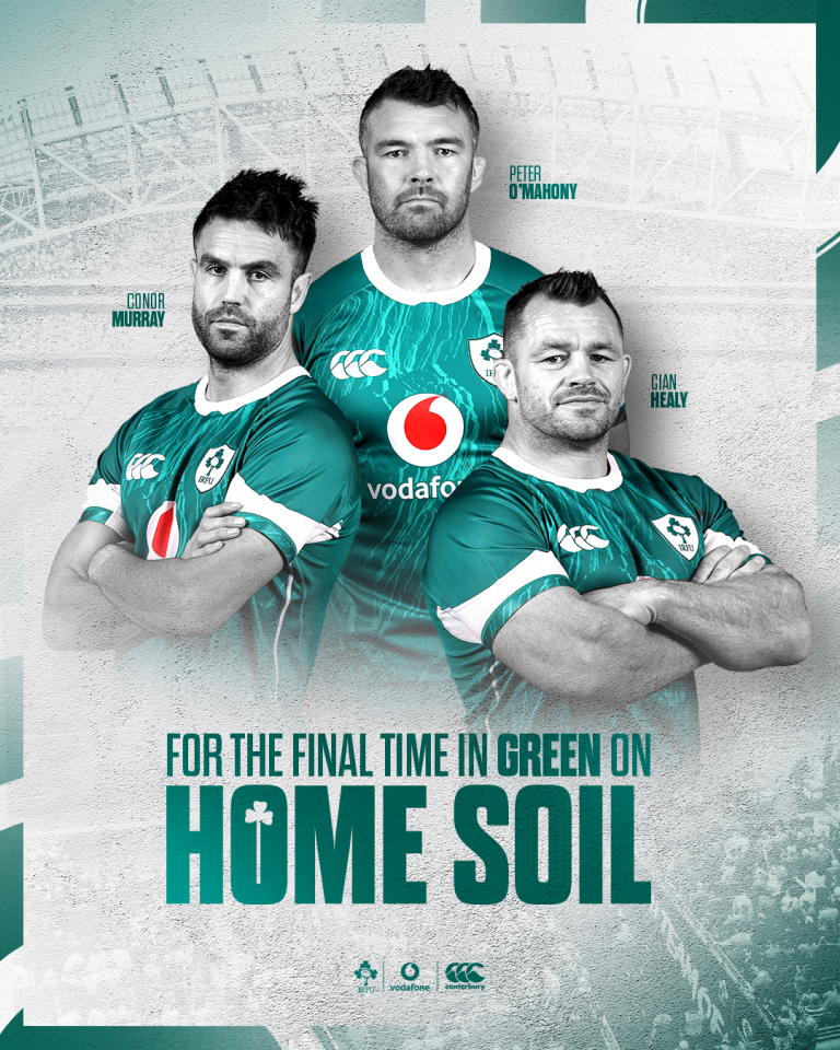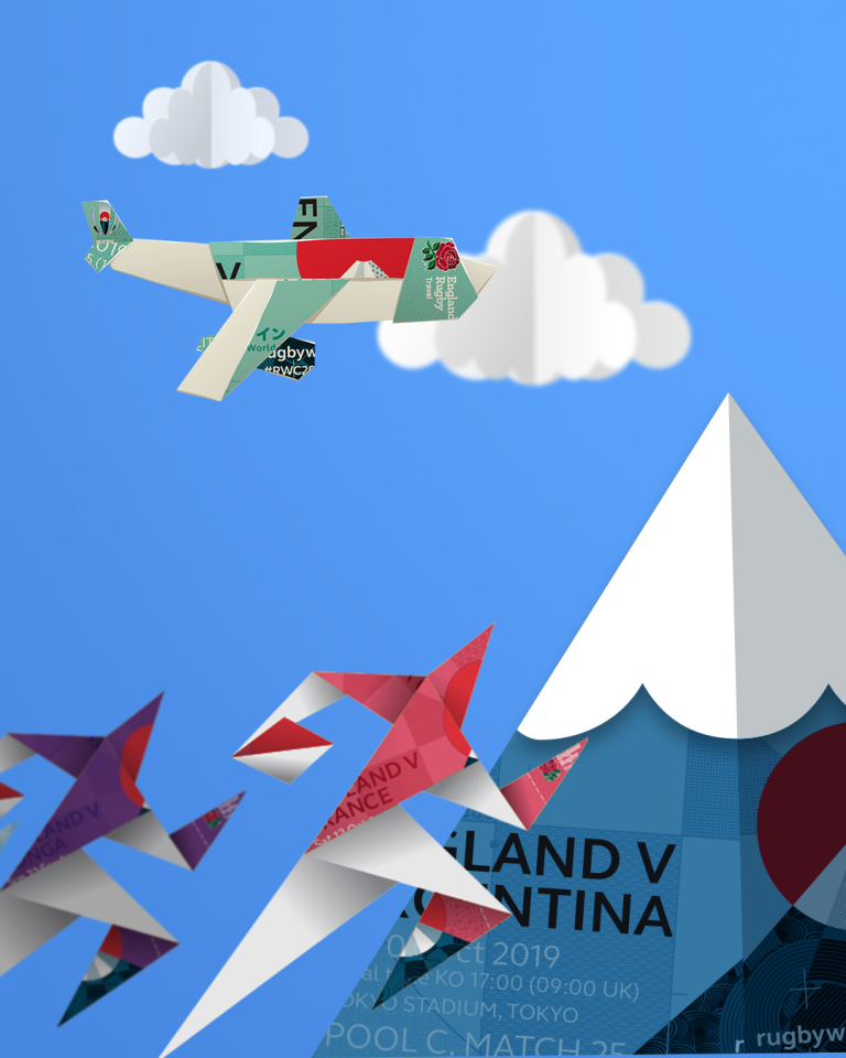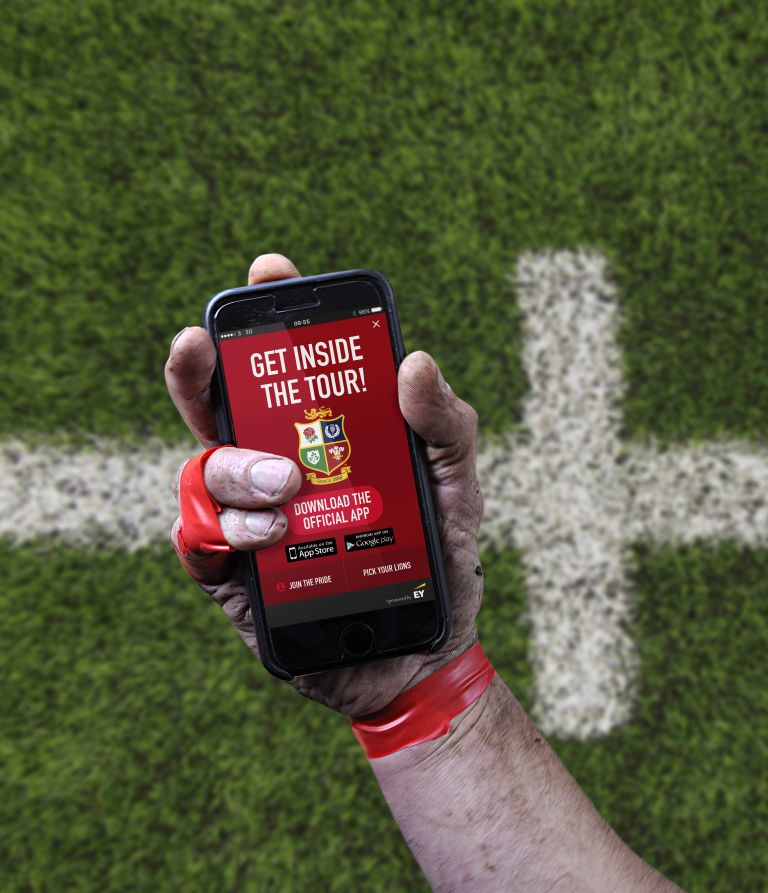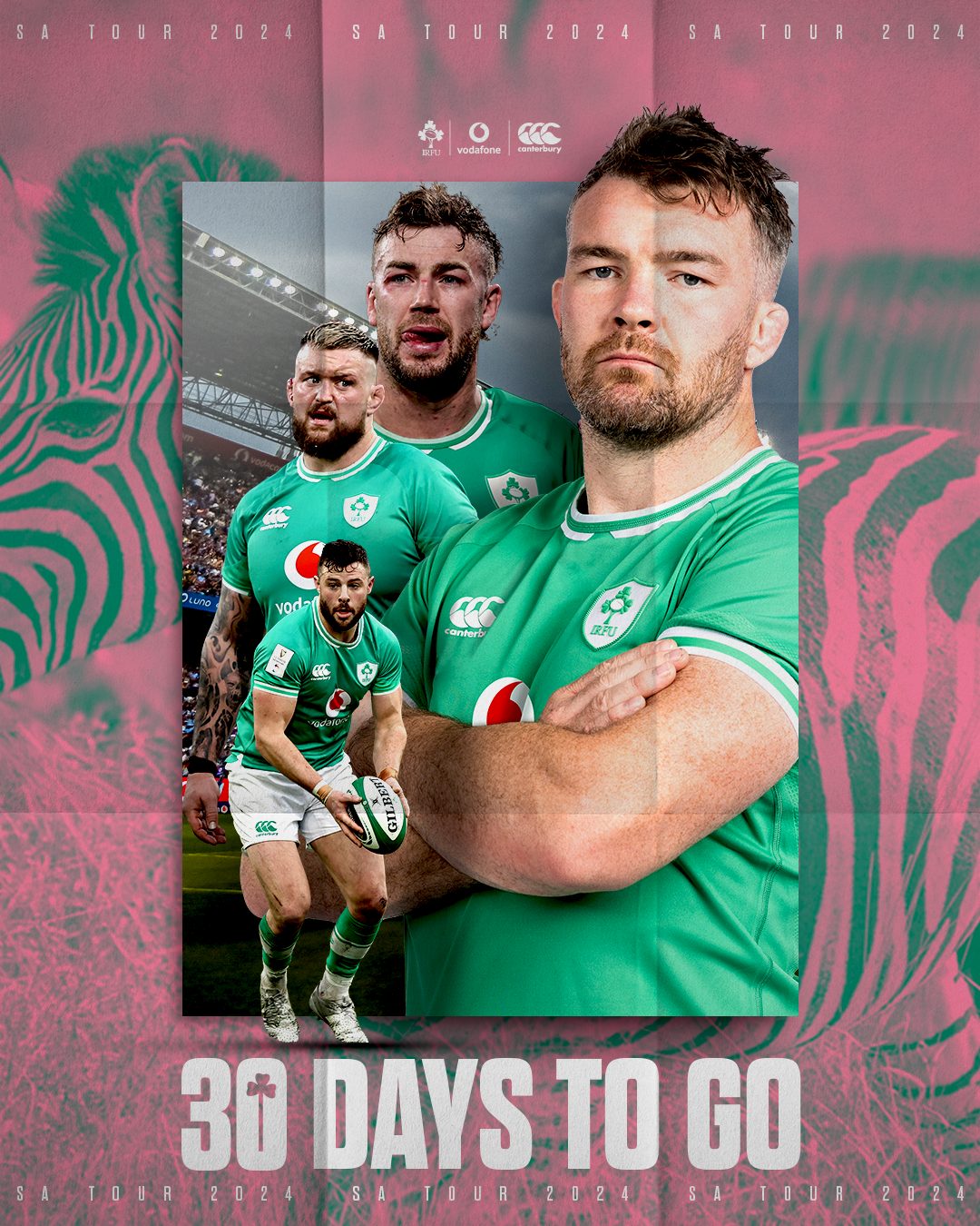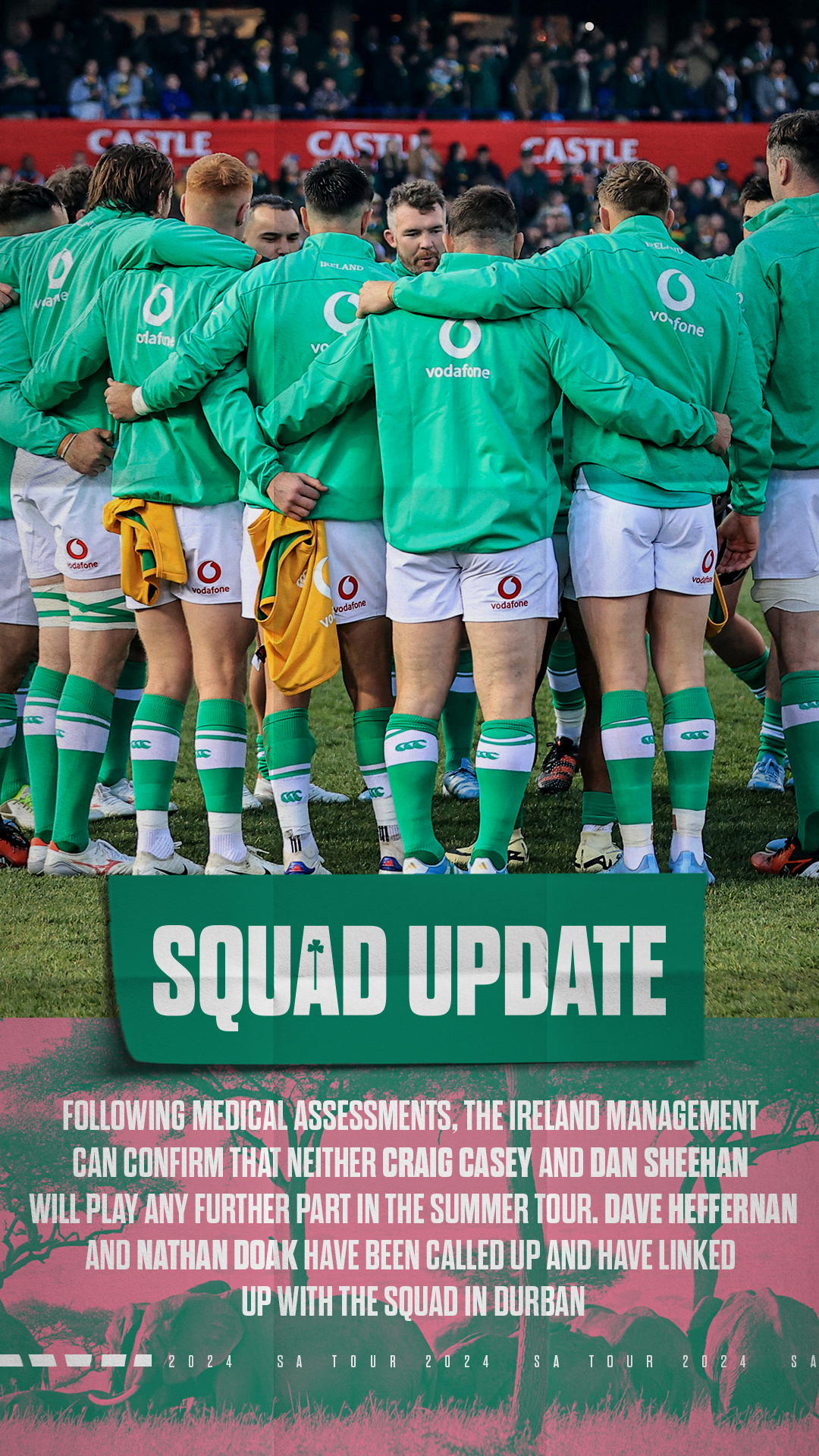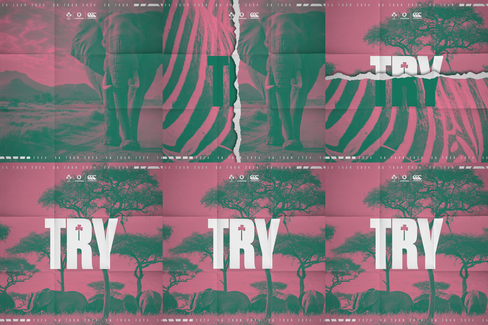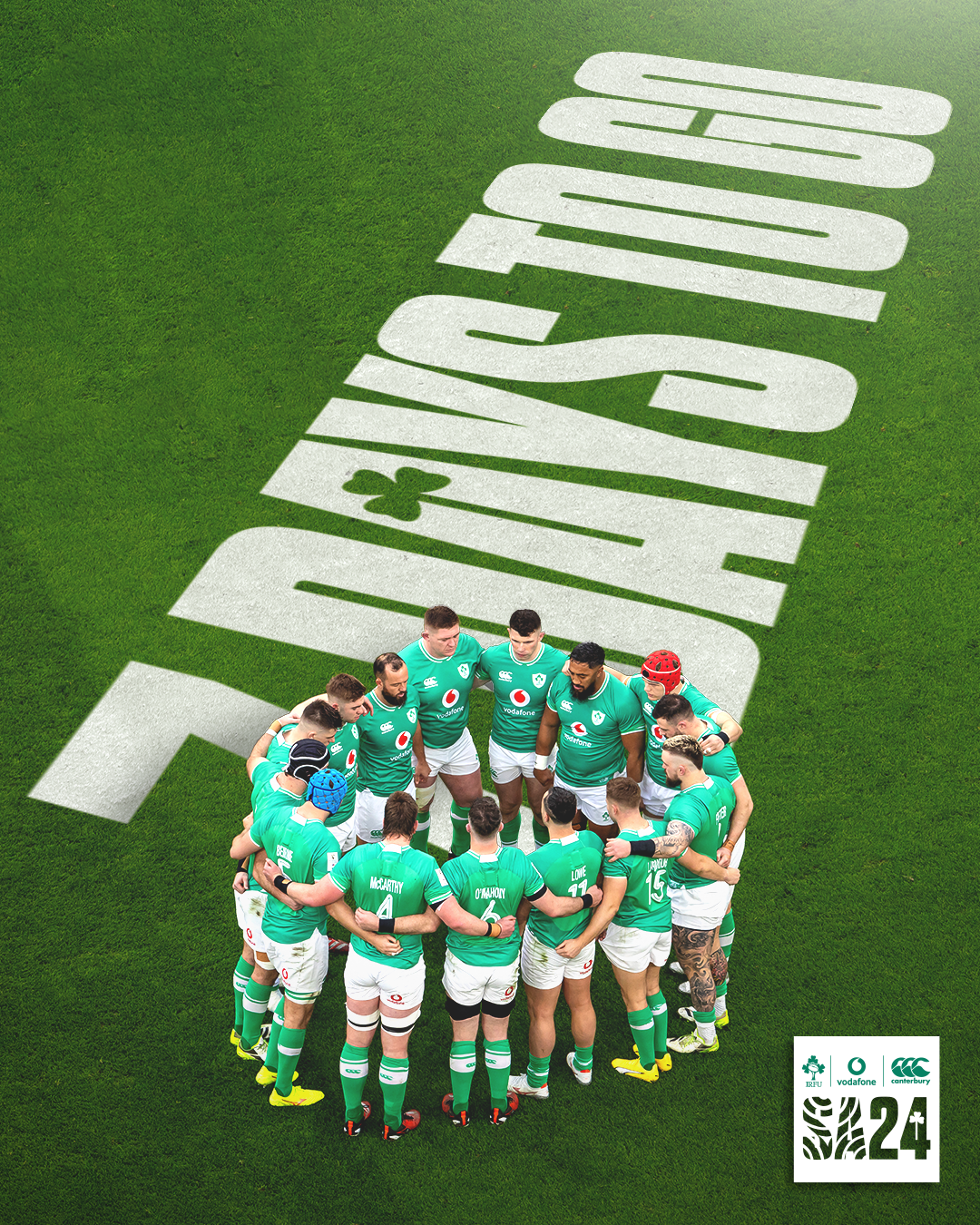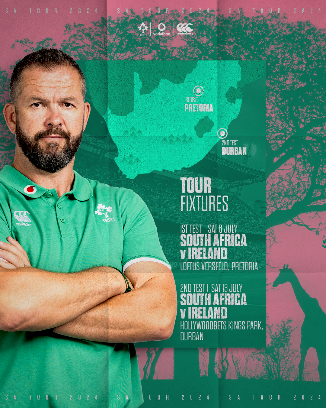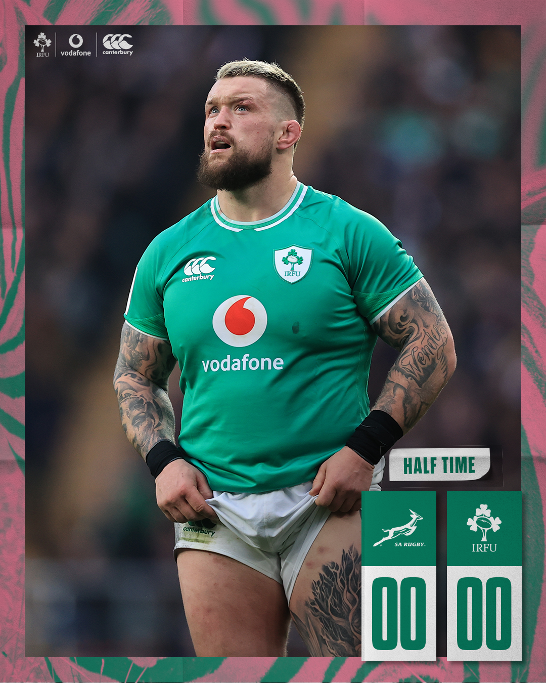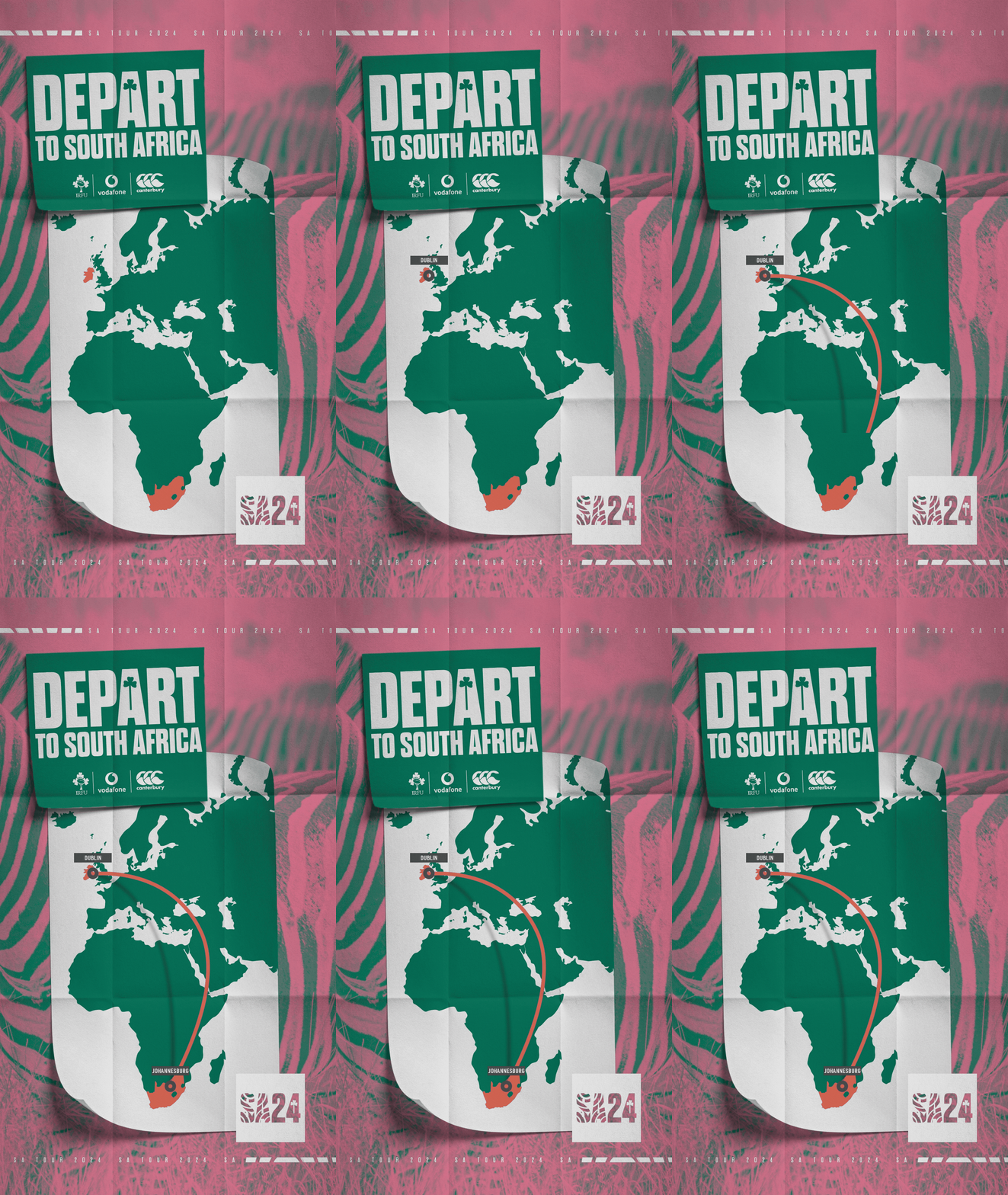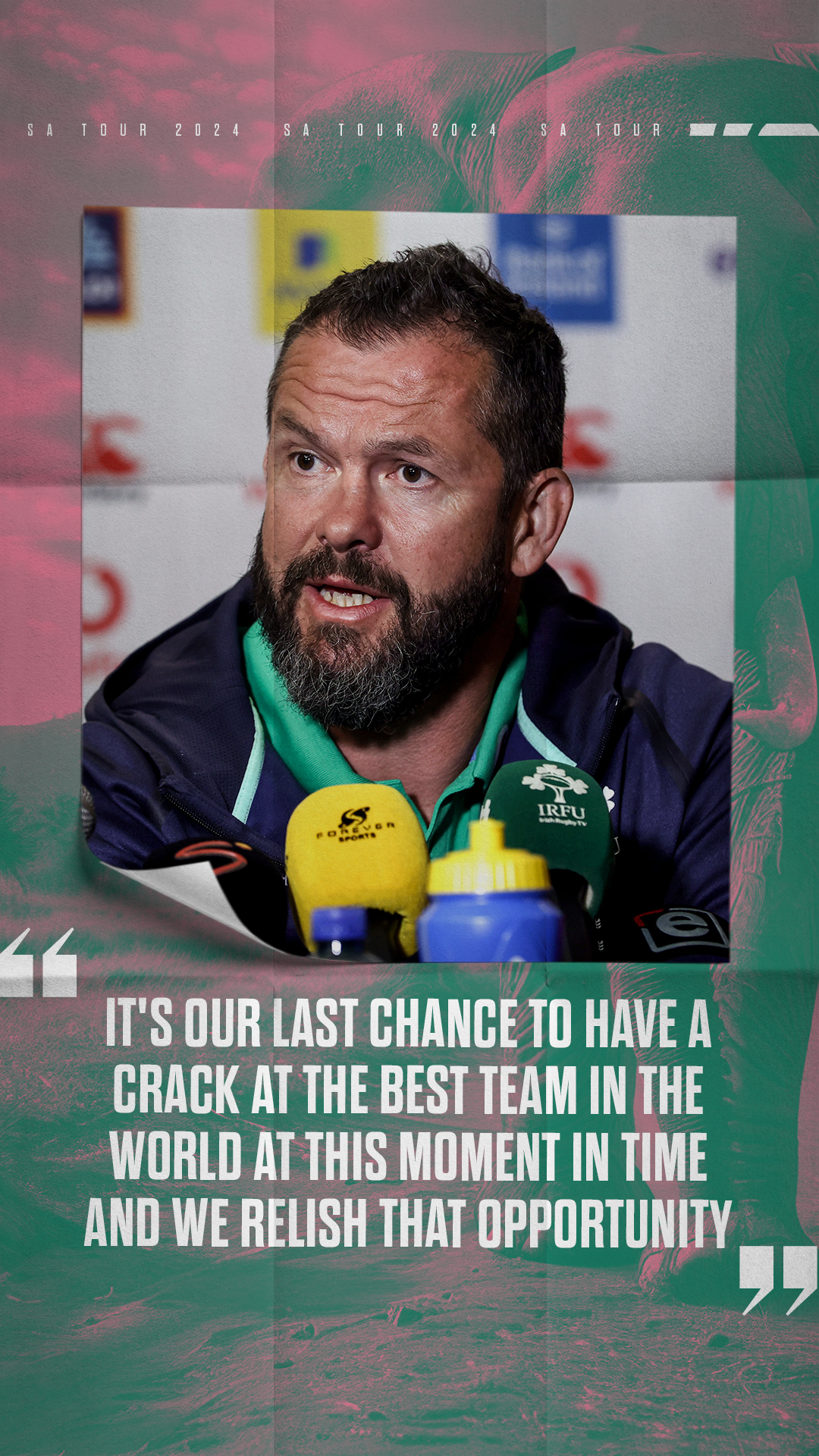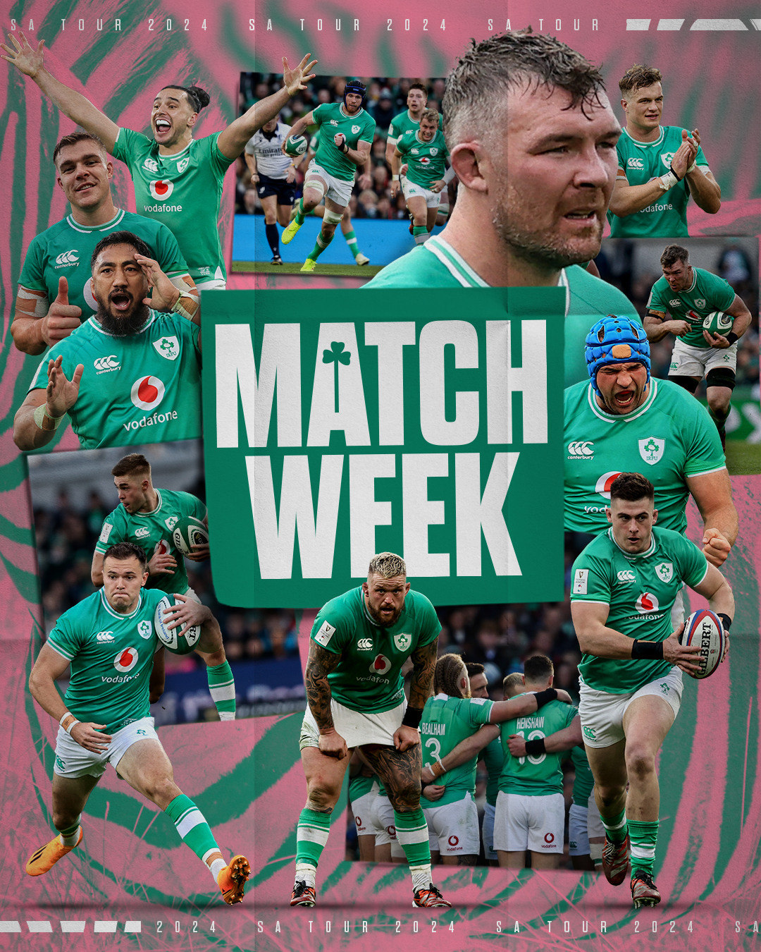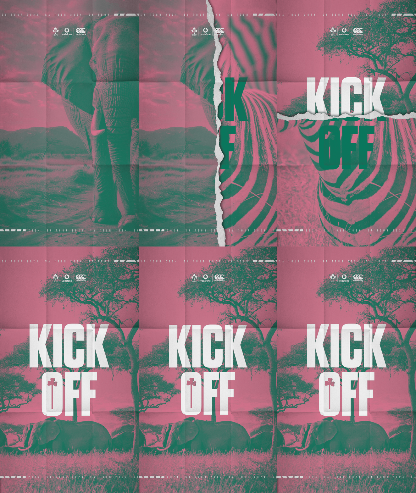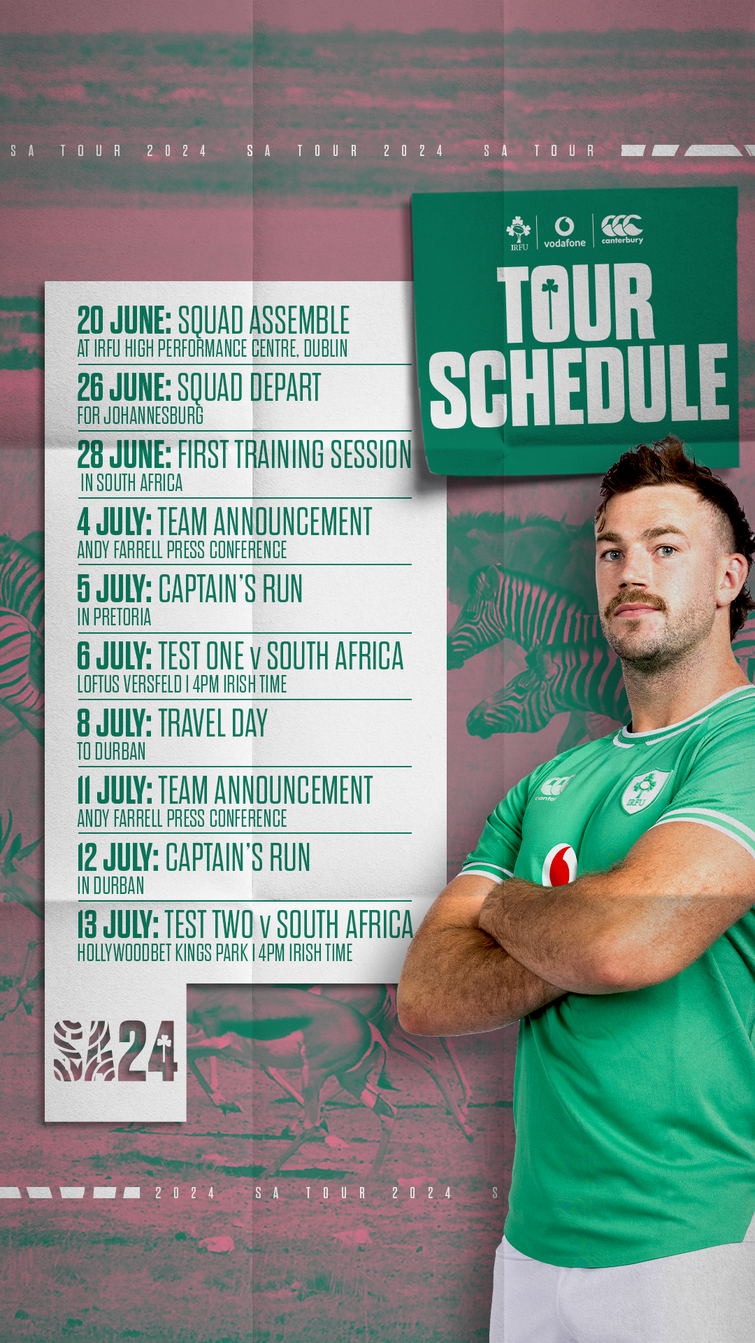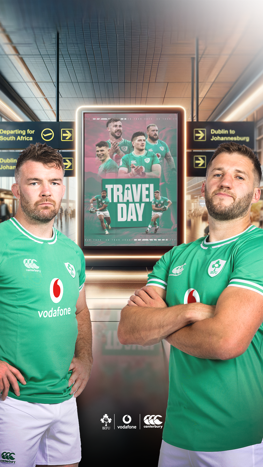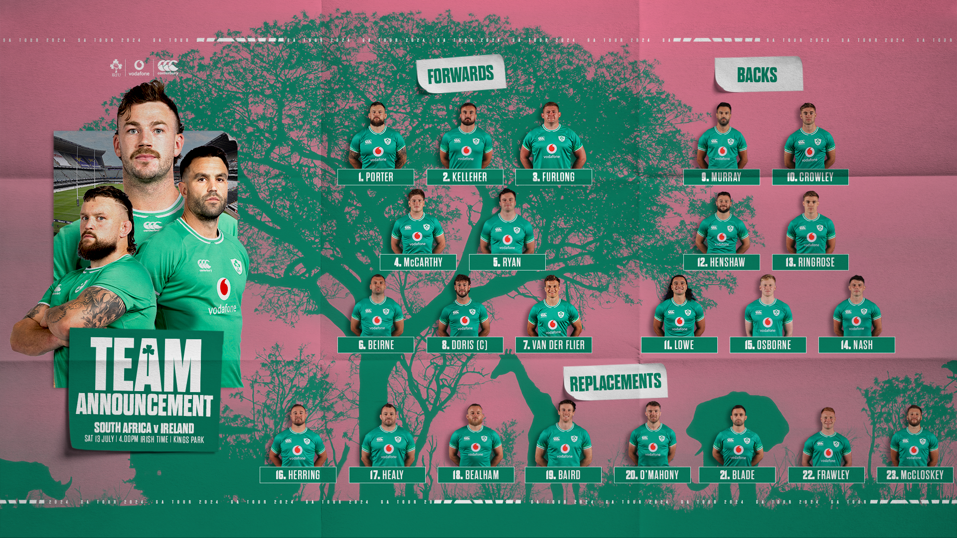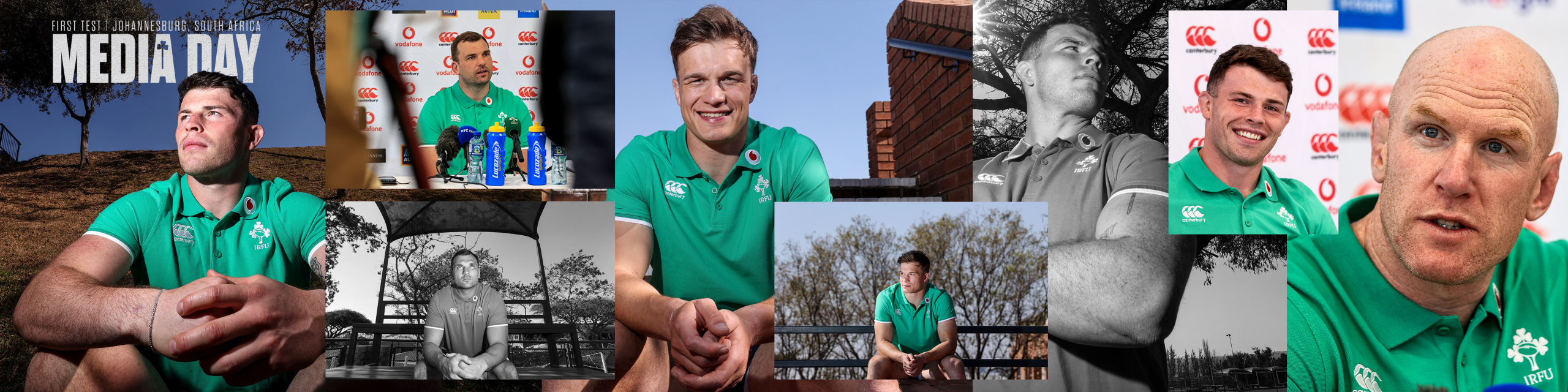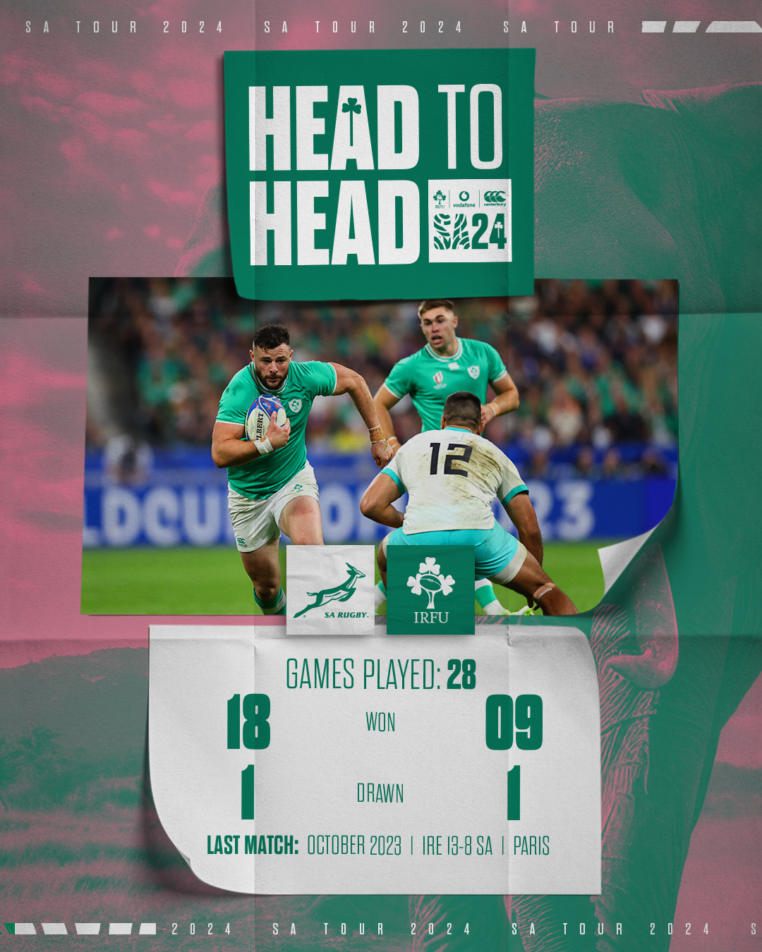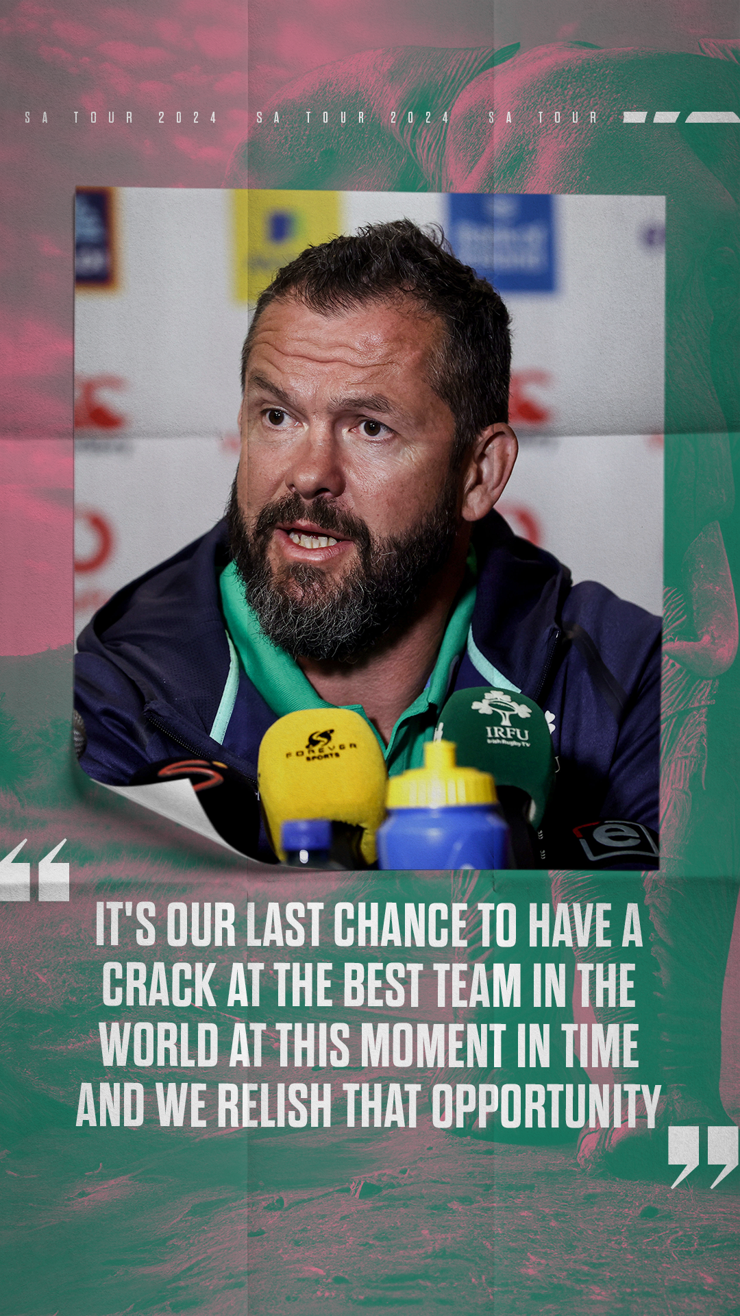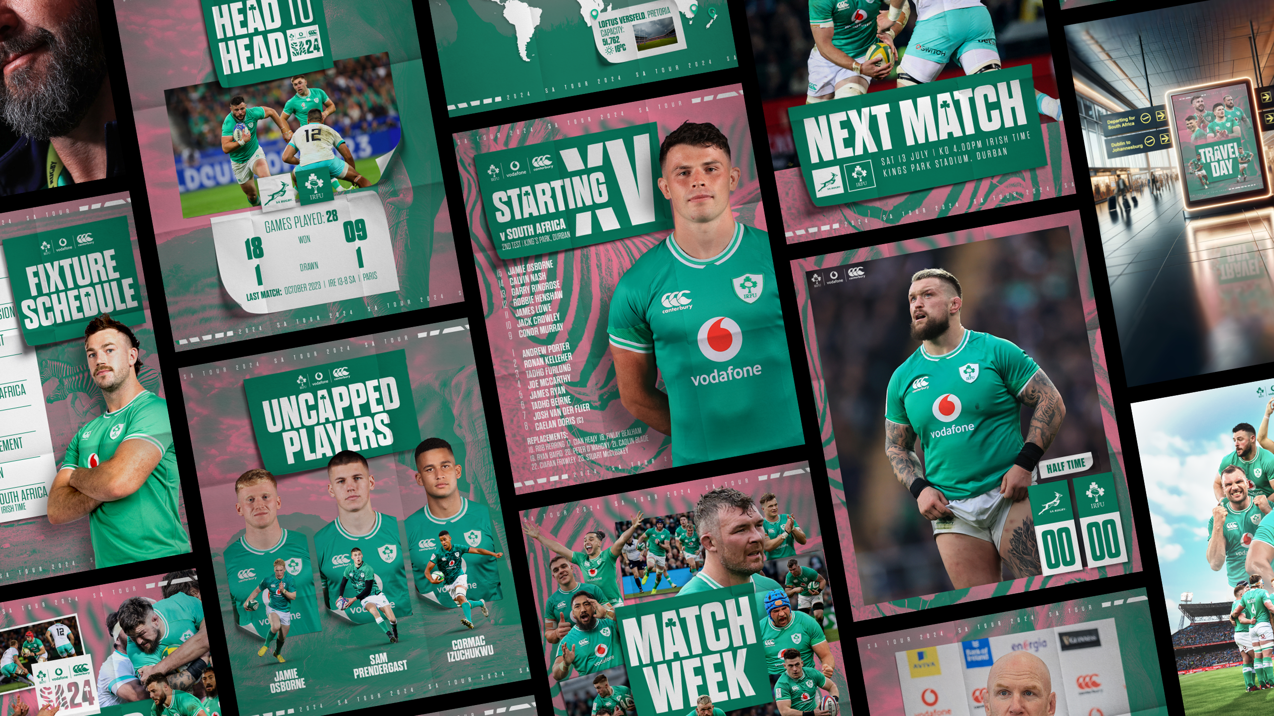
A tour within itself. The client wanted to separate the tour from their busy schedule whilst maintaining a loose visual link, but really wanted something that stood out but was still identifiable as part of the brand.

We decided to get cut through in a busy season we needed a colour change and a different visual style whilst retaining some of the existing brand architecture like the Shamline and Triskele elements we had created. We also added some location specific cues to further enhance the design, it was a lot of fun to work.
The campaign was well received, both internally and externally, and engagement figures were up again, which was good for sponsor reports as we had worked hard to make sure that we were hitting placement targets for Commercial. It also allowed us to separate the end of that season and allow a clean start and return to brand when the new season started a few months later; something that was really important as a typical season sees a lot of channel congestion with Men’s, Women’s, U20s and Sevens, as well as domestic rugby all jockeying for position over the 12-month period.